
Student event app
case study
Design concept of app for unniversity students,
that want to form new "student" bonds.
Date: May 2022 (ongoing)
Tools: Figma, Miro, Sticky notes, Pencil and paper
Type of project: Experimental

Problem
New students on university often experience loneliness and difficulty to form new relationships due to the new environment.
Solution
Mobile app, that would alow students to find events on campus so they can join them, and that way meet other students and form potential friendships.
The process
Jump straight to the section:
1. Discovery of the problem
As a first step, I tried to focus on the new university students. While I didn't have an access to any specific audience where I could apply surveys, I collected a small amount of qualitative data from forum on Reddit.
I found out, that some students (especially introverts) found themselves to be very lonely once they started to study on university. Feeling lonely in a new city was their biggest pain.
There was also a pattern for these people: their preffered way to form new connections was via events, sport games and etc. (as they claimed: "there is no social pressure, and making friends just happens naturally"). And that's when the idea of event app for students hit me.
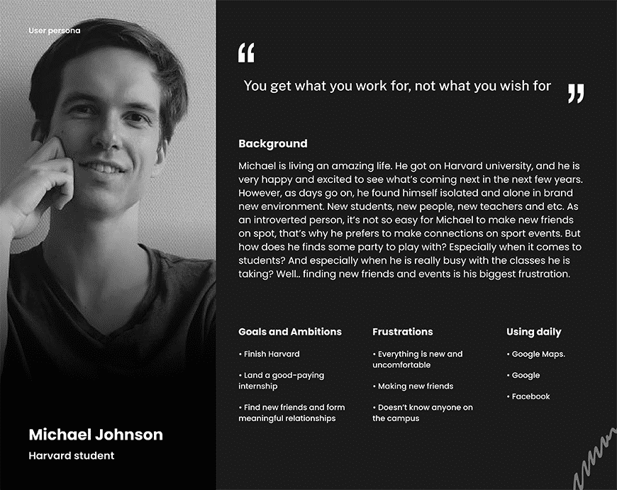
So here we have our imaginary persona Michael, that represents our ideal user. This helped me a lot when doing certain decisions.
For example: On the main app screen you can see that I added a section with events that are happening TOMORROW. But why? Well, students are busy - and they don't want to make a commitment weeks / months down the road. There is MUCH LESS friction with commitment for next day since they know already if they have time. We could also change it maybe for "Events this week".
I found out, that some students (especially introverts) found themselves to be very lonely once they started to study on university. Feeling lonely in a new city was their biggest pain.
There was also a pattern for these people: their preffered way to form new connections was via events, sport games and etc. (as they claimed: "there is no social pressure, and making friends just happens naturally"). And that's when the idea of event app for students hit me.
So here we have our imaginary persona Michael, that represents our ideal user. This helped me a lot when doing certain decisions.
For example: On the main app screen you can see that I added a section with events that are happening TOMORROW. But why? Well, students are busy - and they don't want to make a commitment weeks / months down the road. There is MUCH LESS friction with commitment for next day since they know already if they have time. We could also change it maybe for "Events this week".
2. Crafting User Flow Diagram for a simple event app
Once I had a user persona and a broad idea in my head about the app, I moved on creating User flow diagram.
User flow diagram is primarily used by UX teams. They basically do this in order to figure out the flow of the user on the app / website, in order to present the user with most reasonable options and information.
Here on the right side, you can see a very basic diagram starting with user opening the app. Final step is joining the event.
While there could be many more diagrams and steps - I kept it really simple.

3. Low fidelity prototype & Sketching
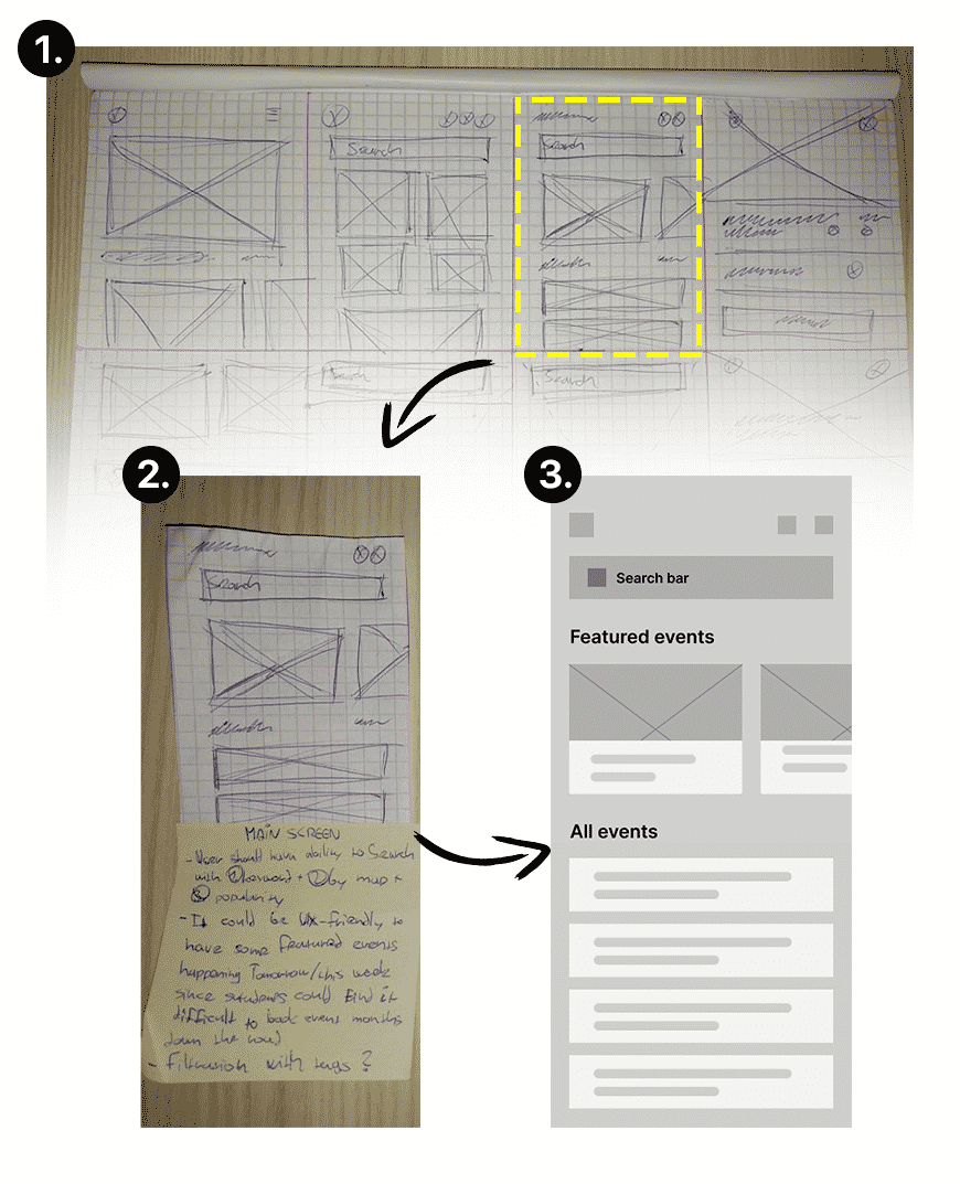
Another step was to create a very low fidelity prototype.
I also like to keep it "old school" and use pencil with sticky notes - and then turn it into interactive design file inside of Figma.
In the 1# image you can see I brainstormed and sketched various layouts.
Then, I cut out the ones I think are great (see 2# image). Also, as I'm sketching, I get all sorts of ideas which I write on sticky notes. It's really helpful.
You see.. The main goal of lo-fi prototypes is to translate high-level design concepts into some form of digestible format, so the team can check and test functionality rather than the visual appearance of the product. That's why WE ARE NOT paying attention to details such as shadows, colors, fonts and etc. All of that is important, just not in this step.
You will see in the next step, that we add a lot of stuff that's not even in the initial prototype - which is always the case.
4. High fidelity prototype
One of the last steps is taking the feedback and data from lo-fi testing, and applying new learnings on High fidelity prototype.
This hi-fi prototype now has most of the details that final product will have when team agrees to ship it.
As you might already know, lo-fi doesn't only apply to design. It also applies to content and interaction. That's why we now see a better-designed prototype with more functionality and content.

5. Testing with users - pending...
As a last step, I still have to test this prototype with actual users.
First things first, I'll conduct user testing with 5 people. Why only 5?
According to nngroup study, 5 users usually uncover 80% of usability mistakes. For 100% you would need to test with 15 users. So we can form conclusion, that testing after 5th user tends to be wasting of the resources (money & time).
So here is what is recommended to do.. After first round of 5 user tests, I'll take the insights and will improve the prototype to get rid of those mistakes.
Once I have new improved version of the prototype, I'll conduct user testing with another 5 people once again. This is done in order to uncover new possible usability flaws that were created with new prototype + also to uncover the rest of the 20% usability mistakes.
Then I'll craft final prototype, which I will test on more unniversity students. I plan to do this also in person, so I can observe the users and get better qualitative insights. What I would also like to do is to obtain some quantitative data from heatmaps - however for that I don't have enough resources to make it happen.

